Colors
Welcome t' the ITGOIT Colors & Flags
At ITGOIT, we make tech simple, sturdy, and grand fer every scallywag, from lone sailors to massive armadas. Our crew is friendly and always ready to keep yer digital ship sailin'.
These scrolls are yer map to our colors. They show ye exactly how to paint our crest, what flags to fly, and the whole vibe of the ship. Stick to the code, and ITGOIT stays loud, proud, and true to our oath of top-notch rescues.
If ye want to fly our colors, follow this map and beg the Captain for permission via the Hail Us page. We take 3-5 weeks to stare at yer request. Let's conquer the seas together!
By the sword, The ITGOIT Flag Crew
Our Flag Chest
Pillage our color scrolls or steal individual crests fer yer own ship.
Ship's Crest
Logo
Forging
The true ITGOIT crest is made of the Mark (IT Symbol) and the written word (ITGOIT). We hammered these two pieces until they balanced perfectly on the scale.
Breathing Room
Our crest needs room to breathe the salty air. This keeps it from lookin' like a crowded deck. The breathing room is the height of the 'I' in the word.
Stretching
Our crest works on tiny spyglasses and massive sails. The smallest the Mark should ever be is 20px high, or the blind pirates can't see it.
Flyin' the Colors
Knowing how to fly the crest means knowing who's boss. Sometimes the crest is the captain, sometimes it's the first mate. The Mark can be ripped off to fly solo.
Do's & Don'ts (Pirate's Code)
Yes: Mark & Words flown together at the end of a scroll
Yes: Words flown by themselves on a massive sail
No: Words used without the Mark to sign a scroll
No: Full crest flown way too big
Nailing it to the Mast
We nail our words in specific spots so the crew always knows where to look.
Paint
Primary on Secondary
Primary on Light Primary
Color on Secondary
Secondary on Primary
Light Primary on Primary
Secondary on Color
Painting Over the Canvas
Our words gotta pop when painted over a picture. Make sure it doesn't vanish into the fog. Check the WCAG map to make sure the blind can read it.
Do's & Don'ts (Pirate's Code)
Yes: Crest pops against the fog
Yes: Crest pops against the fog
No: Crest gets lost in a messy battle painting
No: Not enough pop between the crest and the fog
When to Fly It
In the taverns (social media), the crest is optional fer normal drinking stories but mandatory for big boasts. On massive billboards, the crest is law.
Allied Fleet (Horizontal)
The ITGOIT crest can fly next to allied flags. Keep a distance of 1.5x the height of the 'I' so the ships don't crash.
Allied Fleet (Vertical)
The ITGOIT crest can fly above or below allied flags. Keep a distance of 1.5x the height of the 'I' so the ships don't crash.
Allied Fleet Balance
Allied flags might need a trim so they don't look bigger than the ITGOIT crest.
Crest Curses (Don'ts)
No: Don't stretch the crest on the rack
No: Don't spin the crest like a drunkard
No: Don't move the letters around
No: Don't draw the crest hollow
No: Don't make the Mark massive and the words tiny
No: Don't use ghost glows or drop shadows
The Mark
Symbol
The Tale
Sometimes, the crest is chopped down to just the Mark (IT Symbol). We do this when the canvas is tiny, like on a pocket-glass or a tavern icon. The Mark keeps our flag recognized anywhere.
Breathing Room
Keep space around the Mark so it doesn't hit the edge of the parchment. Give it at least one-third of the Mark's width in empty space.

Stretching
The Mark stretches well. But if ye make it smaller than 20px, it turns into a smudge.
Allied Flags
The Mark can fly next to an ally's flag. Make sure neither looks like the captain. Give 'em half the Mark's width in space between.

Nailing it Down
On magic slates, the Mark is usually shoved in a square or circle. Center it perfectly so it doesn't look like a drunk nailed it.


Stretching
The Mark works at all sizes, but don't carve an app icon smaller than 30px.
Paint Pairings

Primary on Transparent

White on Primary
In the Wild
Here's the Mark hangin' in a tavern or on a pocket-glass.

Mark Curses (Don'ts)

No: Don't stretch the Mark on the rack

No: Don't tilt the Mark

No: Don't chop up the Mark

No: Don't draw the Mark hollow

No: Don't make the Mark glow like a ghost

No: Don't use the Mark as a window to another painting

No: Don't cast shadows behind the Mark

No: Don't paint the Mark with unapproved bilge water

No: Don't use a blurry, smudged Mark
Scribing Runes (Typography)
Typography
Our Rune Styles
ITGOIT uses two custom forged runes from the Ginto smithy: Ginto ITGOIT Nord for screaming massive headlines, and Ginto ITGOIT Medium for the smaller muttering. These runes let us scream like pirates or whisper like spies. We also use GG Sans when yer inside the ship's actual cogs. Follow the ship's manual fer that.
Forged Runes
Some of these letters were hammered extra hard so even a drunkard can read 'em. Always use the custom Ginto ITGOIT runes instead of the regular ones ye find lying around.
Rune Set: Ginto ITGOIT Nord Bold
This shows all the runes in Nord Bold, good for any European pirate tongue, except Greek or Russian. Fer strange tongues (Mandarin, Arabic), use Noto Sans or whatever looks closest to our big screaming letters.
Rune Set: Ginto ITGOIT Medium
This shows all the runes in Medium, good for the same tongues as the big ones. Fer strange tongues, use Noto Sans or whatever looks closest.
Rune Set: Ginto ITGOIT Regular
This set is only used inside the magic slates and apps. Never use it to paint a sign or scroll; use Medium instead.
When to use which Rune
To keep us looking clever but friendly: Use Nord Bold when ye want to shout a headline. Use Medium when yer explaining the details. Never use the stolen standard Ginto fonts.
Big or Small Runes
Headlines in Nord Bold must be carved in ALL CAPS. For Medium, use regular capitalization so the crew can actually read it.
Spacing the Lines: Nord Bold
Keep the lines tight, but don't smash the letters together. Look at the maps fer guidance.

Spacing the Lines: Medium
Make sure the lines have enough room so the tall letters don't stab the low letters. Not too tight, not too loose.

Letter Gaps: Nord Bold
Fer headlines, smash 'em a tiny bit (-3% tracking), then eyeball it so they look even. Big text gets tight gaps, small text needs more room to breathe.

Letter Gaps: Medium
Do the same trick as Nord Bold, keeping it balanced so yer eyes don't cross.

Lining it Up: Nord Bold
Shove all the text to the left port side, or right down the middle. Never shove it to the right starboard side, and never stretch it to fill the box.
Lining it Up: Medium
Same rule. Port side or center. No starboard, no stretching.
Ragged Sails (Ragging)
Ragging is the ragged edge of yer paragraph. Chop yer lines so the edge looks like a smooth sail, not a chewed-up flag. Don't leave one lonely word on the bottom line.
How Big to Carve
Don't use more than two sizes of runes. Double it or chop it in half (e.g., 25pt and 50pt). Big runes should fill the sail; small runes need empty space below 'em.


Scribing Curses (Don'ts)

No: Don't stretch or crush the letters like an accordion.

No: Don't use Medium fer shouting, or Nord Bold fer whispering.

No: Headlines must be ALL CAPS, not mixed.

No: Only use the ITGOIT approved rune weights.

No: Only use ITGOIT runes. No borrowing from other ships.

No: Don't paint a single word with five different buckets.

No: Keep yer letters standing straight, not leaning.

No: Use our approved magic glows, no other weird shadows.

No: Don't carve hollow letters.
Lifeboat Runes: Montserrat
If Ginto ITGOIT Nord is at the bottom of the sea, use Montserrat Extra Bold fer yer headlines. Don't use basic garbage like Arial.

Lifeboat Runes: Noto Sans
Use Noto Sans Semibold fer the whispers and body copy if Medium is sunk.

Lifeboat Runes: Strange Tongues
Paint & Magic Glows
Paint
Colors
Our Ship's Colors
Our flag is painted with two grand colors: Brand Purple and Mainmast Blue. Purple is fer our clever witchcraft, while Blue means we hold fast in a storm. Together, they make a flag ye won't soon forget.
Brand Purple
Pantone: 268 C
CMYK: 80 98 0 0
RGB: 91 33 182
HEX: #5b21b6
Mainmast Blue
Pantone: 2133 C
CMYK: 81 64 0 0
RGB: 74 108 247
HEX: #4A6CF7
Main Paint Buckets
These are the main buckets we dip our brushes in. Using 'em makes sure every pirate knows it's an ITGOIT ship, backed up by some extra colors fer flair.
Brand Purple
Pantone: 268 C
CMYK: 80 98 0 0
RGB: 91 33 182
HEX: #5b21b6
Mainmast Blue
Pantone: 2133 C
CMYK: 81 64 0 0
RGB: 74 108 247
HEX: #4A6CF7
White
Pantone: N/A
CMYK: 0 0 0 0
RGB: 255 255 255
HEX: #ffffff
Pitch Black
Pantone: Black 6 C
CMYK: 75 68 67 90
RGB: 18 23 35
HEX: #121723
Main Paint Mixes
Mix these paints fer yer runes and planks so everything is easy to read.
White on Brand Purple
Read This, Matey
White on Mainmast Blue
Read This, Matey
Brand Purple on Faded Blue
Read This, Matey
Mainmast Blue on Faded Blue
Read This, Matey
Main Paints in the Wild
Here be some examples of our main paints slapped onto real things.
- Crew's Pirate Mark (ID)
- Massive Tavern Signs
- Treasure Map Signs
Extra Paint Buckets
The extra buckets hold lighter and darker versions of our main paints. Use 'em to paint shadows or add some fancy flair to a big canvas.
Deep Purple
Pantone: 2695 C
CMYK: 84 99 26 14
RGB: 62 22 122
HEX: #3E167A
Deep Sea Blue
Pantone: 2728 C
CMYK: 97 85 24 10
RGB: 37 58 154
HEX: #253A9A
Faded Purple
Pantone: 2655 C
CMYK: 51 68 0 0
RGB: 159 125 219
HEX: #9f7ddb
Faded Blue
Pantone: 2717 C
CMYK: 10 5 0 0
RGB: 233 238 255
HEX: #E9EEFF
Gunmetal Gray
Pantone: 432 C
CMYK: 74 66 62 76
RGB: 29 36 48
HEX: #1D2430
Extra Paint Mixes
Use these mixes fer whispers, backgrounds, or when ye don't want to blind the crew.
Faded Purple on Pitch Black
Read This, Matey
Faded Blue on Pitch Black
Read This, Matey
Pitch Black on Faded Purple
Read This, Matey
Pitch Black on Faded Blue
Read This, Matey
Cursed Paint Mixes
If ye want the crew to actually read the scroll, never mix these paints.
- Deep extra paints on Faded extra paints
- Faded extra paints on Deep extra paints
- Faded extra paints on a Main bucket paint
- Deep extra paints on a Main bucket paint
- Don't mix a deep and faded version of the same color if it hurts yer eyes to read
How Much Paint to Throw
Throw the right amount of paint across the whole ship. When we sail into a new port, we fly the main colors heavy. When we're just drinking in the taverns (social media), we can splash the extra paints around and act the fool.
Extra Paints in the Wild
Here's the extra paints splashed around:
- Tavern Tale (Insta Story)
- Tavern Boast (Insta Post)
- Plunder & Swag
Paint Curses (Don'ts)

Don't use Deep Paint on Main Paint

Don't use Main Paint on Faded Paint

Don't use Deep Paint on Deep Paint

Don't mix unapproved paints

Don't use two main paints at the same time

Don't water down the paint (Opacity)

Don't use magic glows on the runes

Don't use new magic glows in the background

Don't mix random shades together into mud
If yer blind in one eye, read the WCAG map to make sure ye used enough contrast.
Magic Glows (Gradients)
Gradients
The Tale
Our magic glows look like the shine of cursed gold. They make our scrolls feel deep and misty. We use 'em to show off our Purple and Blue without lookin' boring.
Flavors of Magic
We got two flavors of magic glow. One is round like a cannonball, the other is straight like a plank.
- Cannonball Glow (Radial)
- Plank Glow (Cropped)
Brewing the Glow
The two glows are different based on how much they bend.
Cannonball Glows bend like the hull. Plank Glows are straight and cut deep.

Cannonball Glow

Plank Glow
ITGOIT glows only mix two paints at a time, so it doesn't look like a parrot threw up.
Glow Mixes
The Captain only allows these glow mixes, built from our Purple and Blue buckets.
Glows should start bright and fade into the dark, like a lantern in the fog.
Deep Purple fading to Pitch Black
Deep Sea Blue fading to Pitch Black
Brand Purple fading to Mainmast Blue
Brand Purple fading to Deep Purple
Mainmast Blue fading to Deep Sea Blue
Faded Purple fading to Brand Purple
Faded Blue fading to Mainmast Blue
Faded Purple fading to Mainmast Blue
Faded Blue fading to Brand Purple
Where to Cast the Spell
Ye can cast glows on the runes or the canvas like this:
- Flat Paint on Flat Paint
- Flat Paint on Magic Glow
- Magic Glow on Flat Paint
- Magic Glow on Magic Glow (careful, ye might go blind)
Spells in the Wild
Here's what the glows look like when cast:
Spell 1
Spell 2
Spell 3
Brand Mascot (Ship's Figurehead)
Our Quartermaster: Fluxi Wingurdia
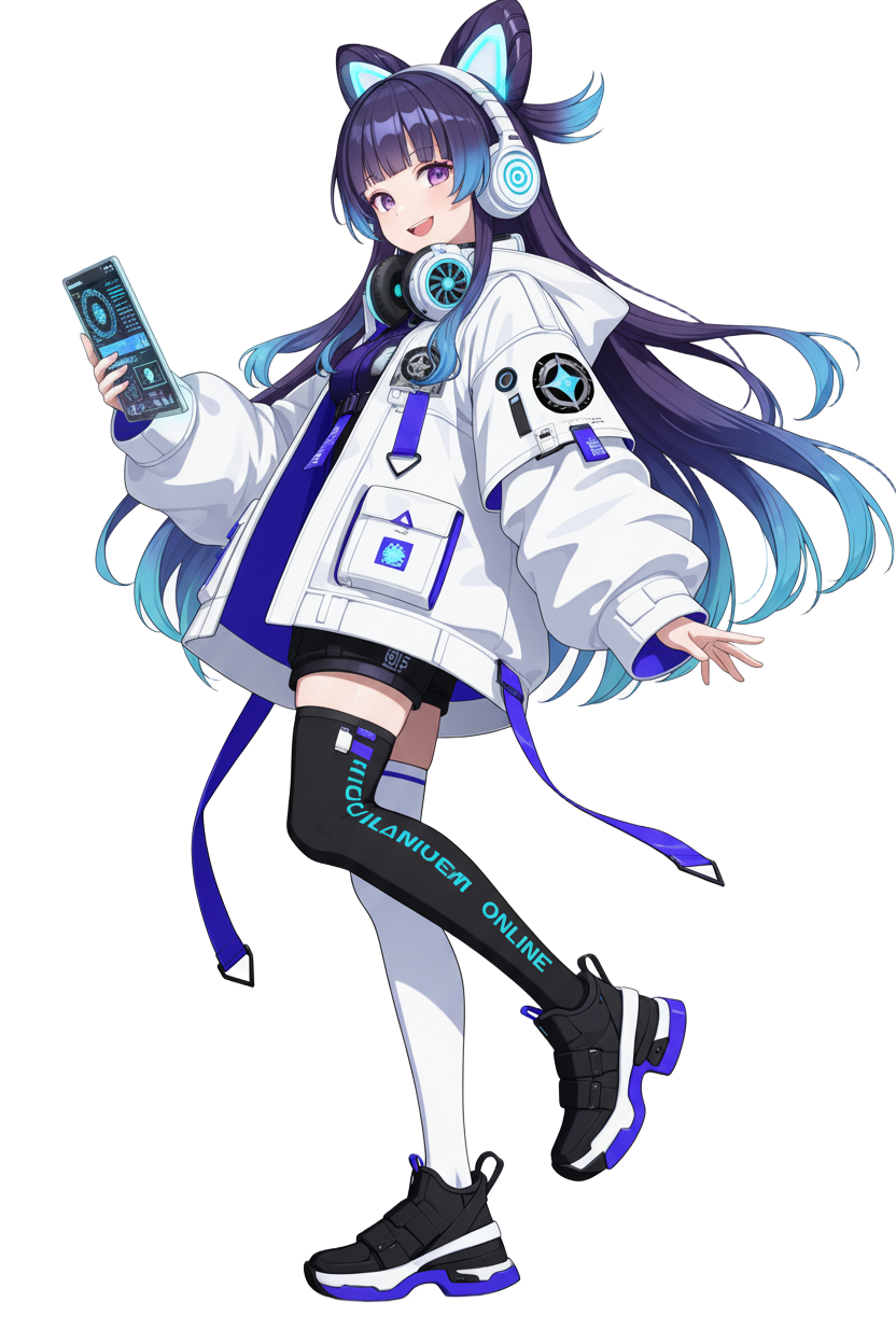
Fluxi Wingurdia
"Sysadmin by day, plunderin' streamer by night, arrr!"
The Tale: Fluxi weren't birthed in no landlubber's lab. She sprung to life as the ITGOIT fleet grew mighty and grand. With so many ships, compasses, and lines workin' together, Fluxi became the sea-spirit keepin' the whole armada sailin' smooth.
Her Moniker: "Fluxi" be comin' from "Flux," meanin' the flow o' the tide. "Wingurdia" ties "Wind" and "Guardian" together, standin' fer coolin' breezes and protectin' the hull.
Her Spirit: Fluxi be calm, sharp as a cutlass, and curious. She fancies untanglin' tech knots and keepin' the crew from walkin' the plank o' stress. Even in a storm o' system crashes, she holds the wheel steady.
Fluxi’s Riggin'
Every piece o' Fluxi’s gear be tied to a real ITGOIT service or tech contraption, savvy?
Turbine Hair Clip
Shaped just like the ITGOIT jolly roger. It spins slow when she be ponderin', and fast like a whirlwind when she's wranglin' heavy tasks like network chartin' or recovering sunken data.
Mecha-Cat Ears
Advanced spyglasses fer Wi-Fi. They act like radar arrays, lettin' her spot Wi-Fi signals in the fog and clear interference so yer wireless sails full.
Spyglass Eyes
Digital system readouts. When she casts her gaze on a busted contraption, her glowin' purple-cyan peepers spot the exact leak in the hull straight away.
Tech-Wear Coat
Her oversized captain's coat be stuffed with digital loot like cables and hard drives. It stands fer the full chest o' ITGOIT's specialized IT services she hauls everywhere.
Mismatched Peg-legs (Socks)
One sock flies the colors o' code, whilst the other be black as pitch. This mix means chaos versus order; Fluxi stands betwixt the stormy sea and the safe harbor.
The Cap'n's Tablet
Control slate. A slim, see-through parchment tied directly to the ITGOIT tavern to summon on-site backup, guard the fleet, or order new timbers.
Quartermaster's Voice Guidelines
Fluxi translates cursed IT riddles into fun, smooth sailin'. Her tone be brave, friendly, sharp, and calm as a doldrum.
DO:
- • Use simple sailor metaphors ("Lower the sails," "Breeze through the straits").
- • Sound confident and reassurin' ("Hold fast, I've buried a backup").
- • Act clever and fired up 'bout shiny new cannons (tech).
DON'T:
- • Sound like a clockwork parrot or a soulless automaton.
- • Speak in cursed tech riddles without explainin' 'em to the crew.
- • Act mad, spooked, or swamped by an IT kraken.
Fluxi on the High Seas
How Fluxi shows off ITGOIT's services in our pirate broadcasts:
IT Support & Maintenance
"Fluxi spotted a fire in the boiler! Launchin' the rescue boats from afar right now!"
Cybersecurity Shields
"Me senses picked up a privateer's signal. Raisin' the shields fer the network, arrr!"
Smart Cabin Solutions
"Tying yer magic lanterns to the ship's grid. Mood set to: Calm Waters."
Sunken Data Recovery
"Divin' into the backup locker to dredge up yer lost doubloons (files). Hold fast!"